R Data Visualization: ggplot2
Plotting with the grammar of graphics
March 16, 2026
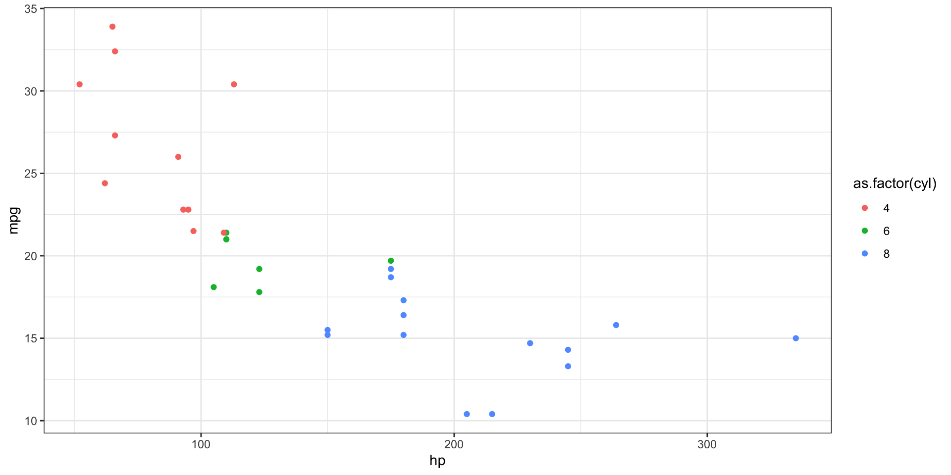
An Example Plot
Let’s look in detail how this works.
An Example Plot
But it would have looked pretty silly.
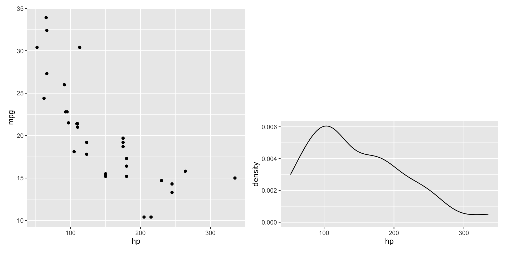
Multiple layers

We would get both geometric objects drawn on the chart!
Multiple layers

Notice that our geom_line is also using the color aesthetic.
What if we wanted it to be black instead?
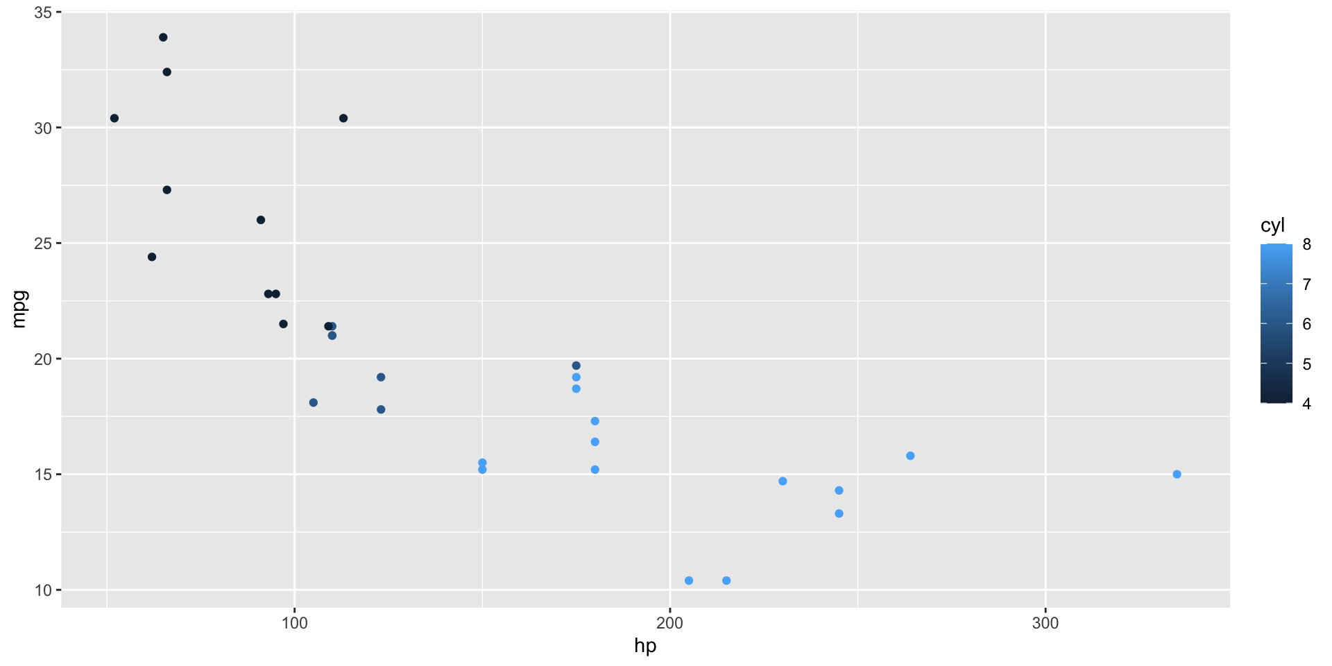
Setting aesthetics by layer

Instead of having one plot-wide aesthetic, we can set aesthetics for each layer.
Adding additional aesthetics by layer
Or we could set the common aesthetics in ggplot() call, and just add color for geom_point().
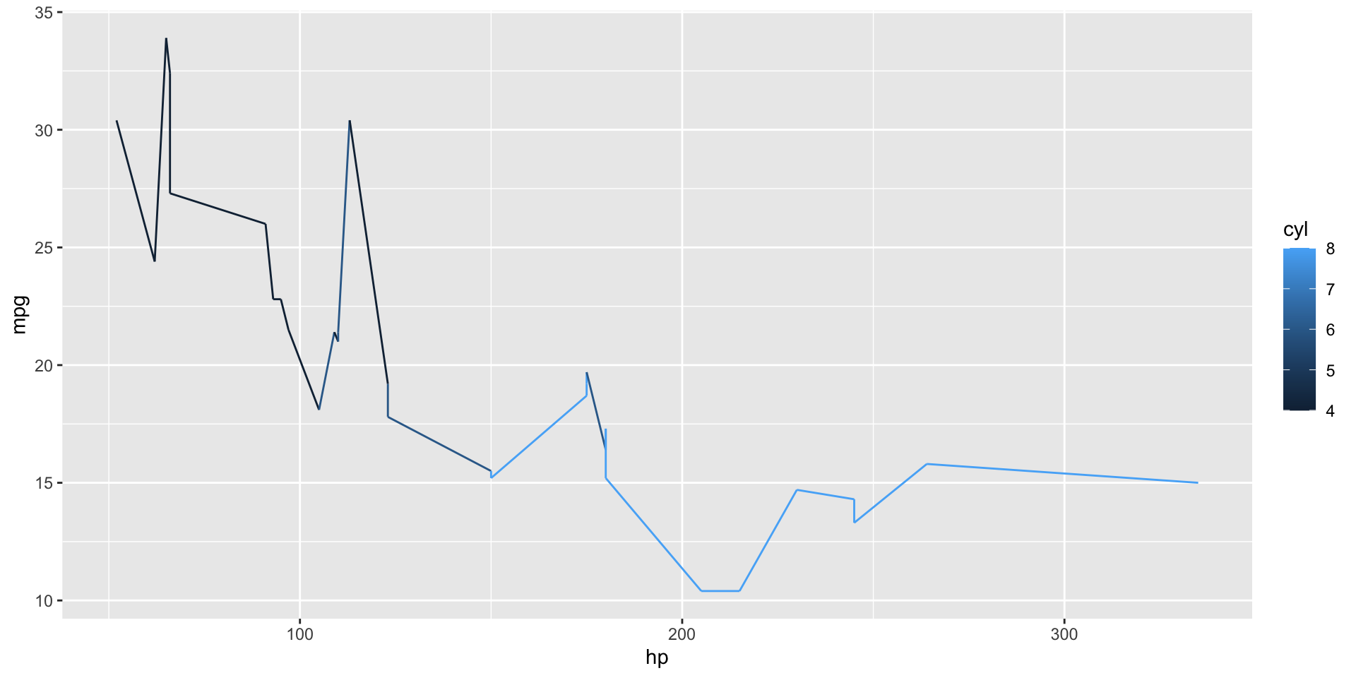
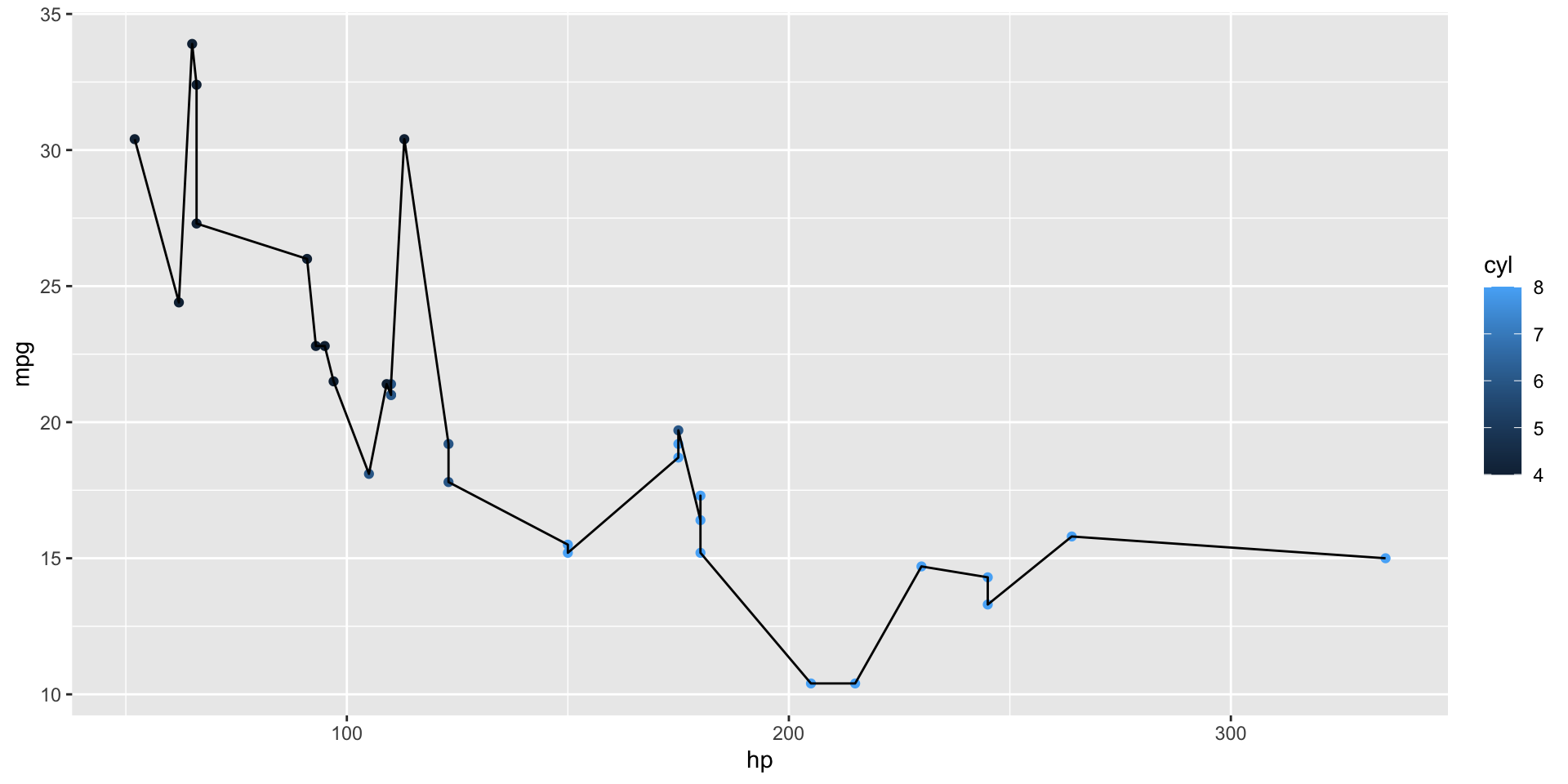
Overriding by layer

Or we can override plot-wide aesthetics for individual layers.
Notice that we don’t use aes(color = "black").
X and Y scales
The most used scales are for the x- and y-axes.
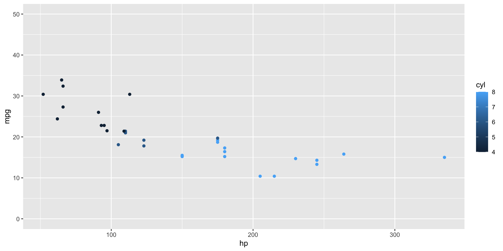
X and Y scales
Use _continuous() scales because X and Y are both numeric.
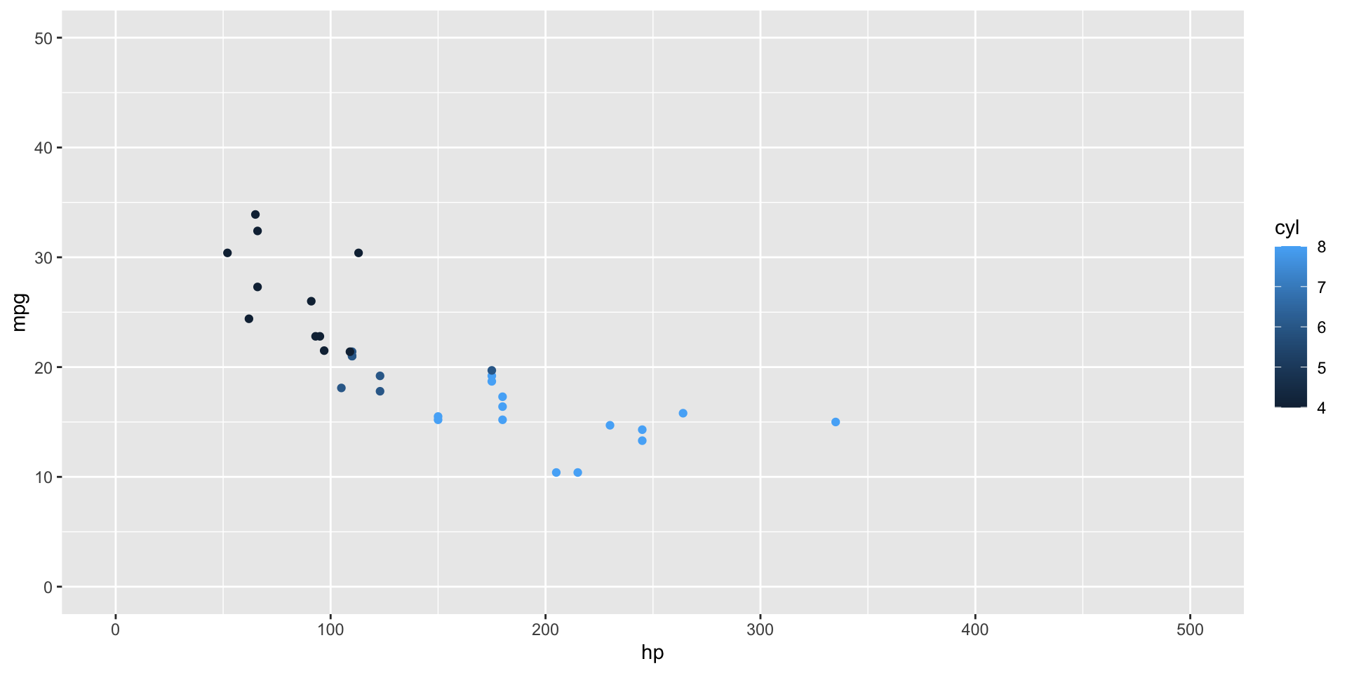
For discrete data, use scale_x_discrete().
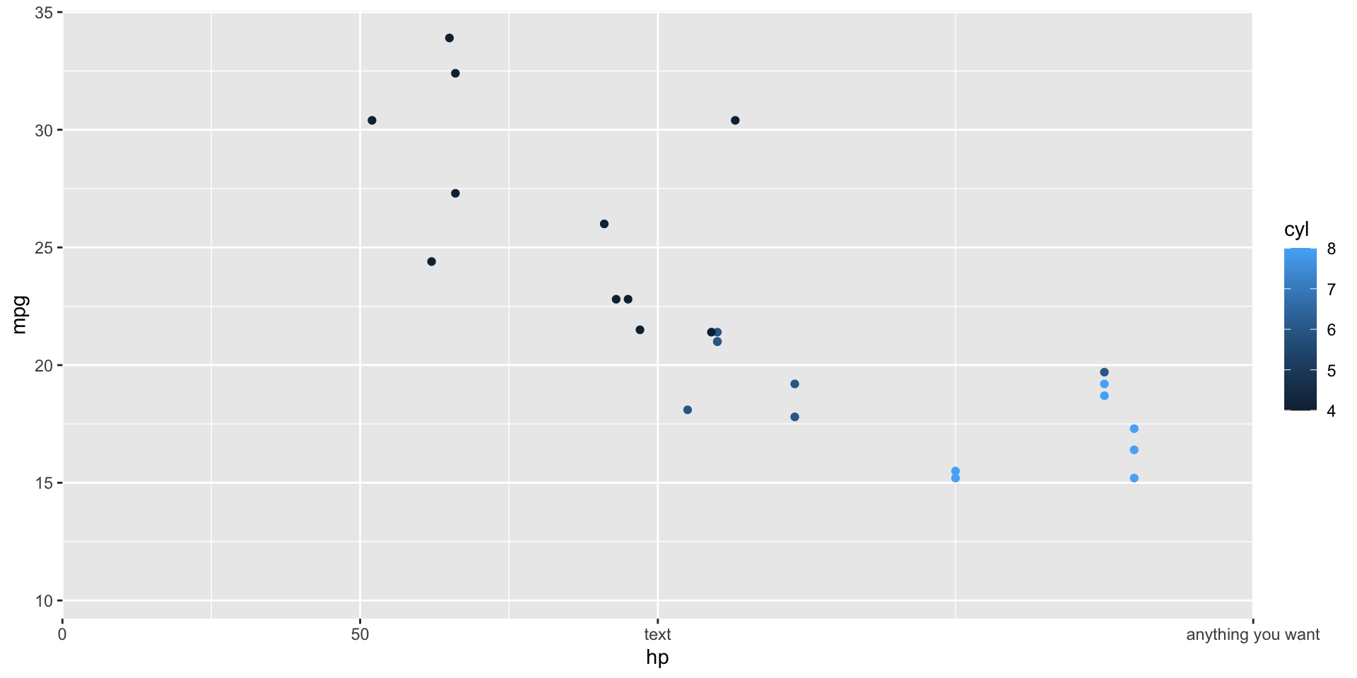
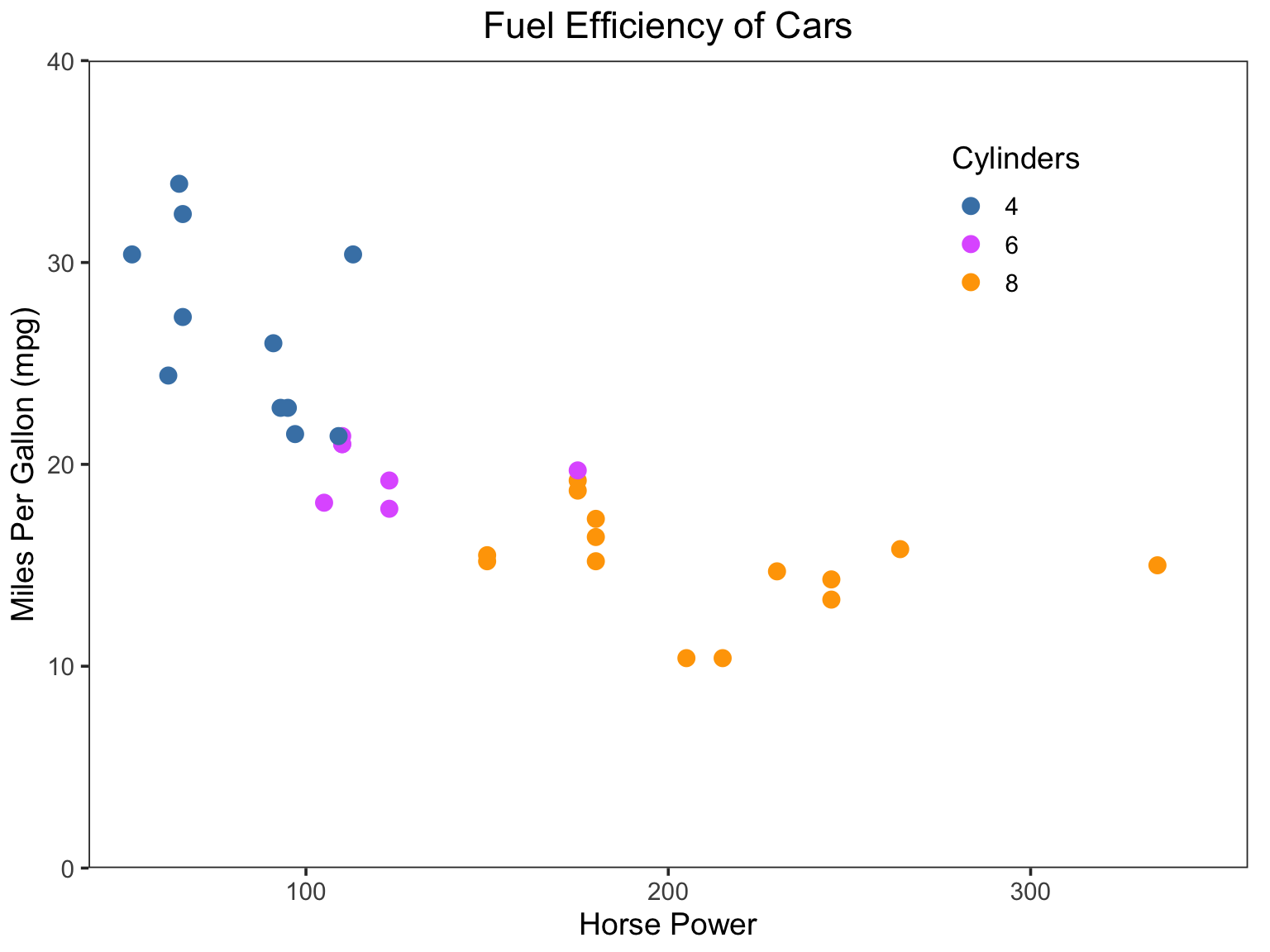
Scale options in action
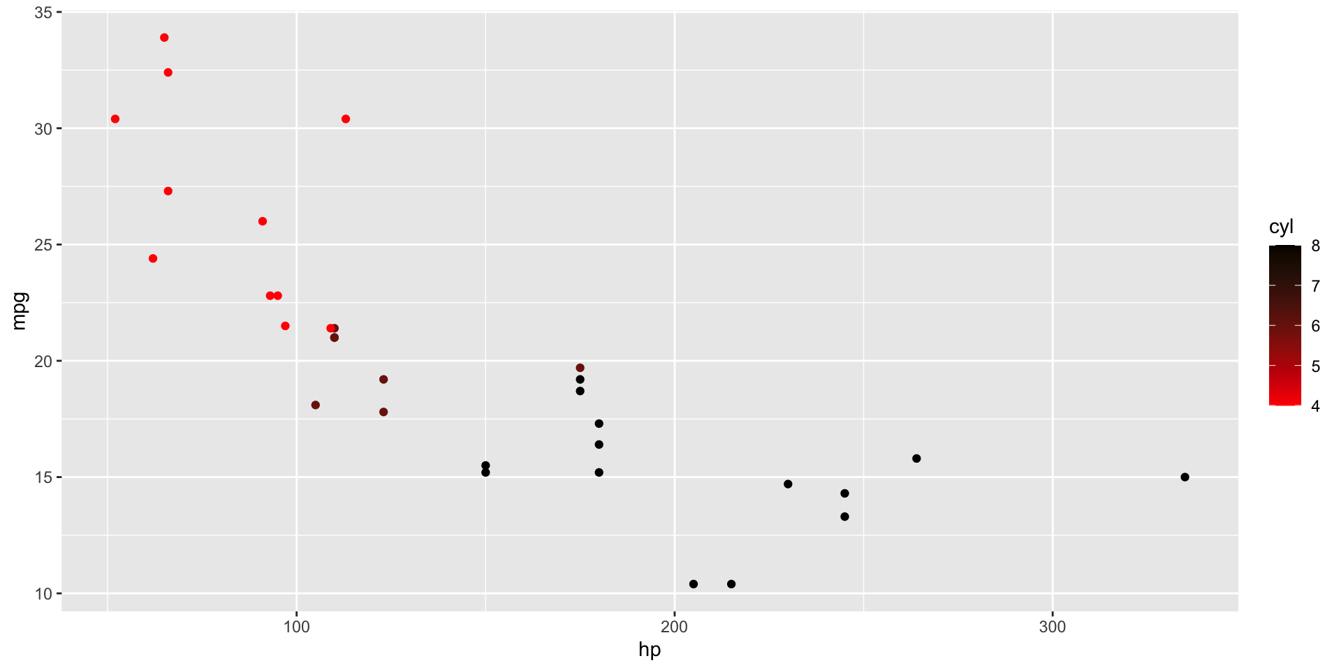
Color scales
The default continuous color scale is
Discrete colorscales
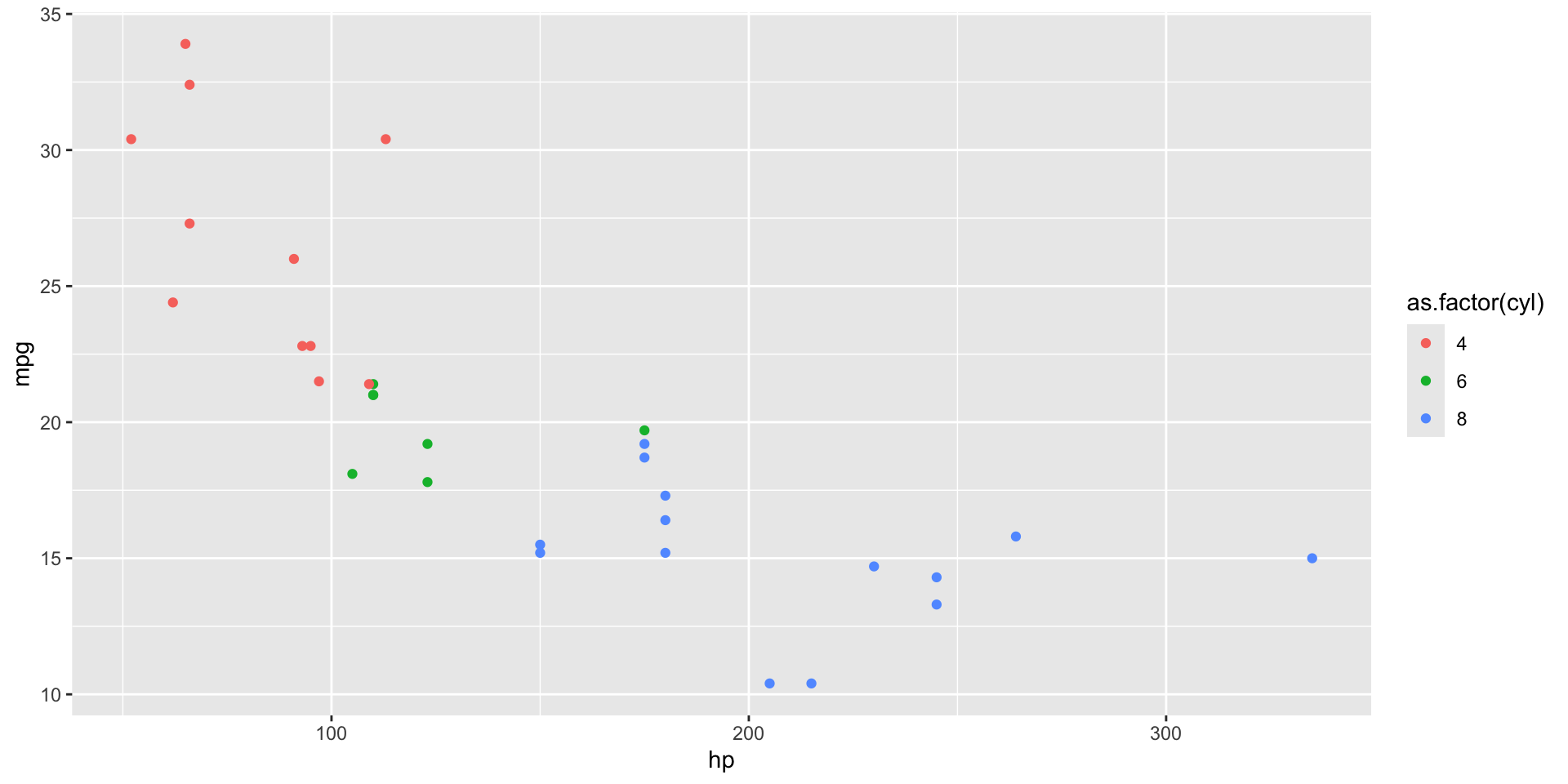
For changing discrete colors, use scale_color_manual().
Discrete colorscales
Use the “values=” argument to provide your own colors.
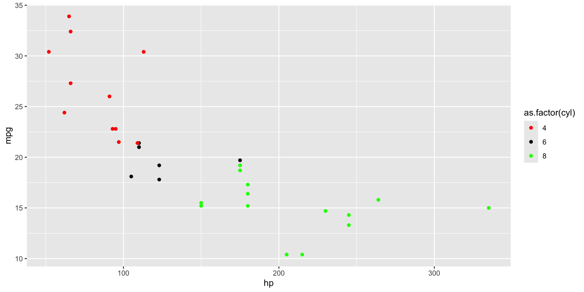
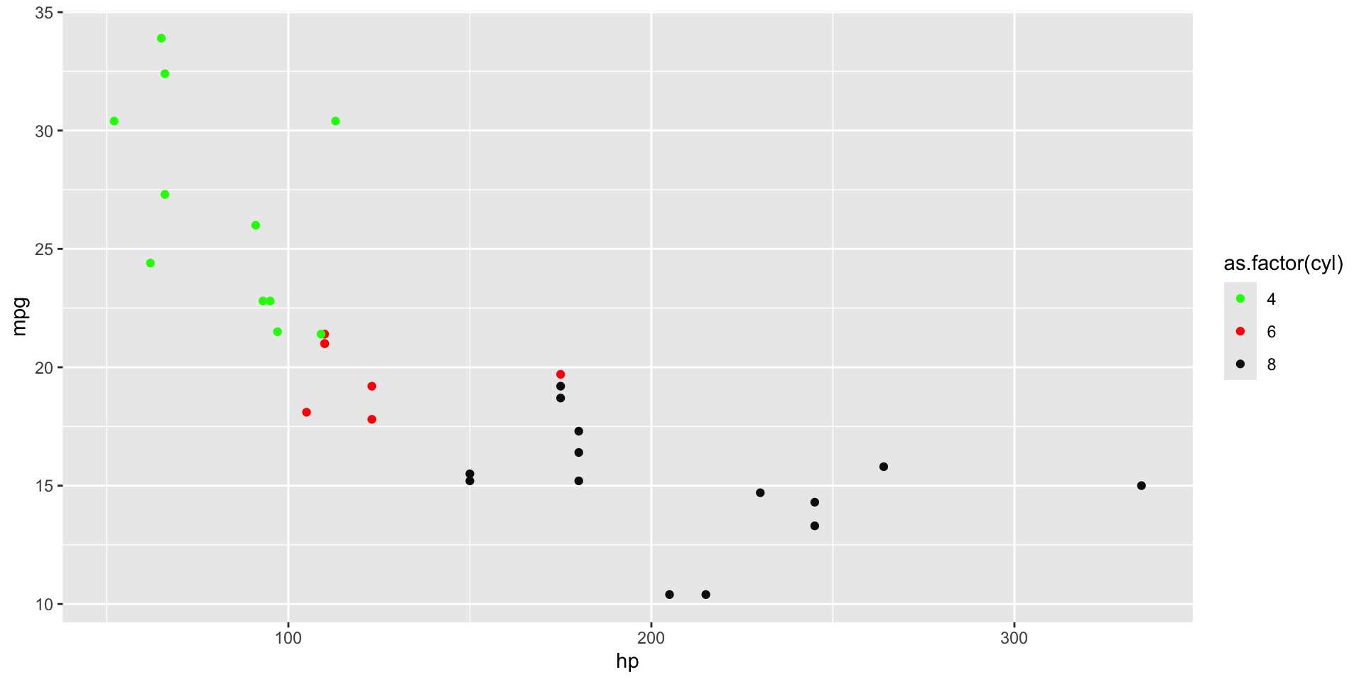
Discrete colorscales
Use a named vector to match them to specific color values.
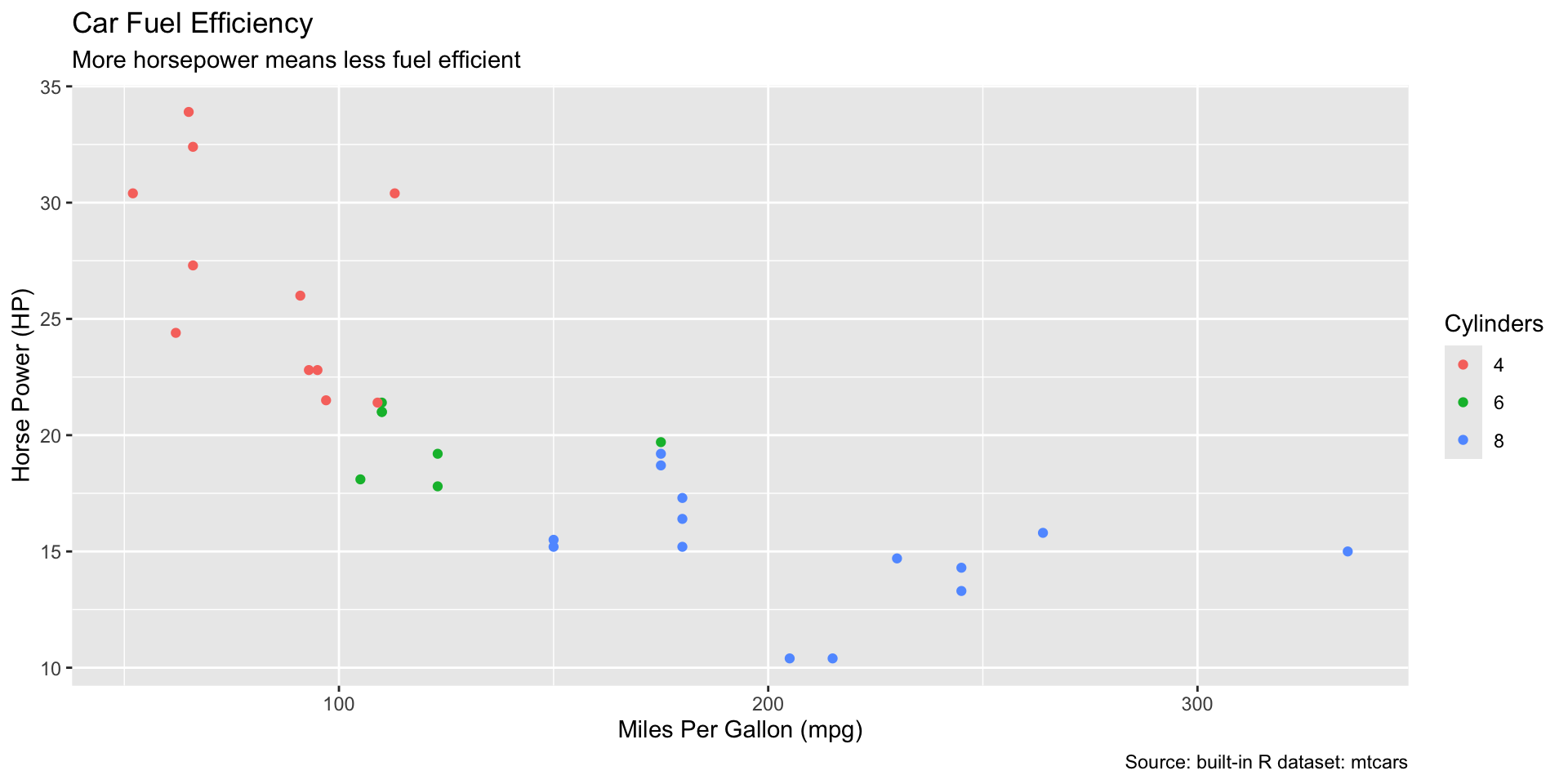
Changing Plot Labels
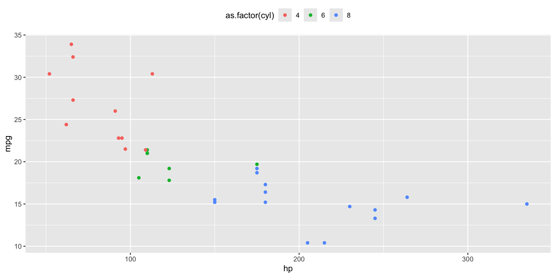
ggplot themes
Want to quickly change how your plot looks? Change the theme!
Editing a theme
All elements of a theme can be edited using + theme().
Economist Theme
The Economist!
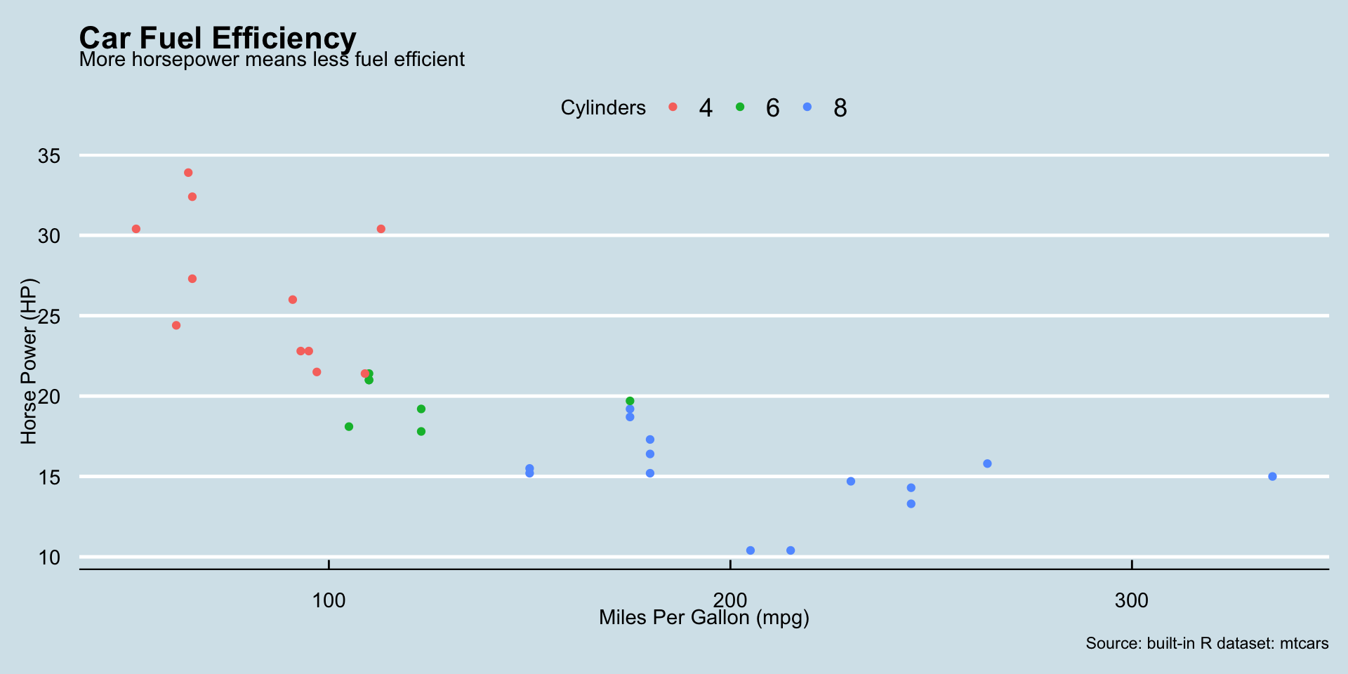
WSJ Theme
The Wall Street Journal!
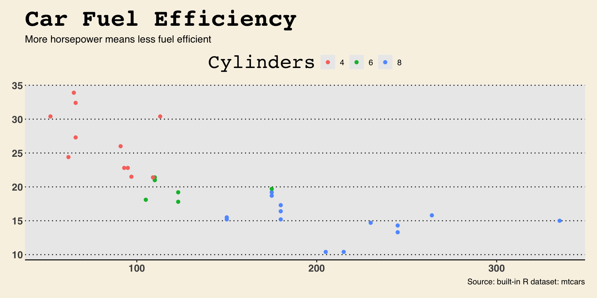
STATA Theme
… or Stata??

My version of our example plot
Facetted example plot
facet_wrap() constructs plot panels from one variable.
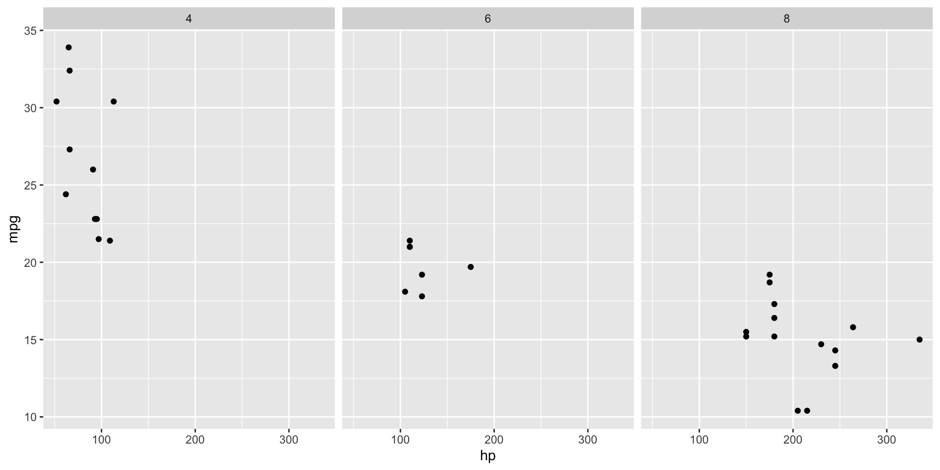
Facetted example plot
Use scales="free" to let the scales vary by panel

2-D facets
You can create a grid of facets using facet_grid and two variables

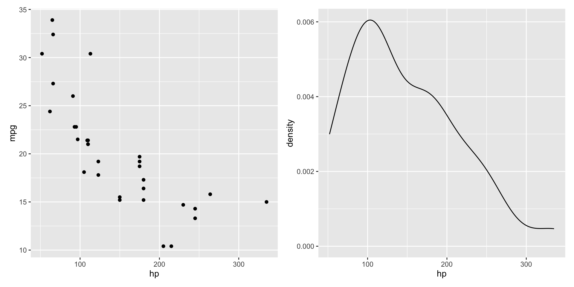
Combining plots
We can combine two plots side by side with |.
Combining plots
We can combine two plots in a column with /.

Combining plots
And we can mix and match to get complicated layouts.
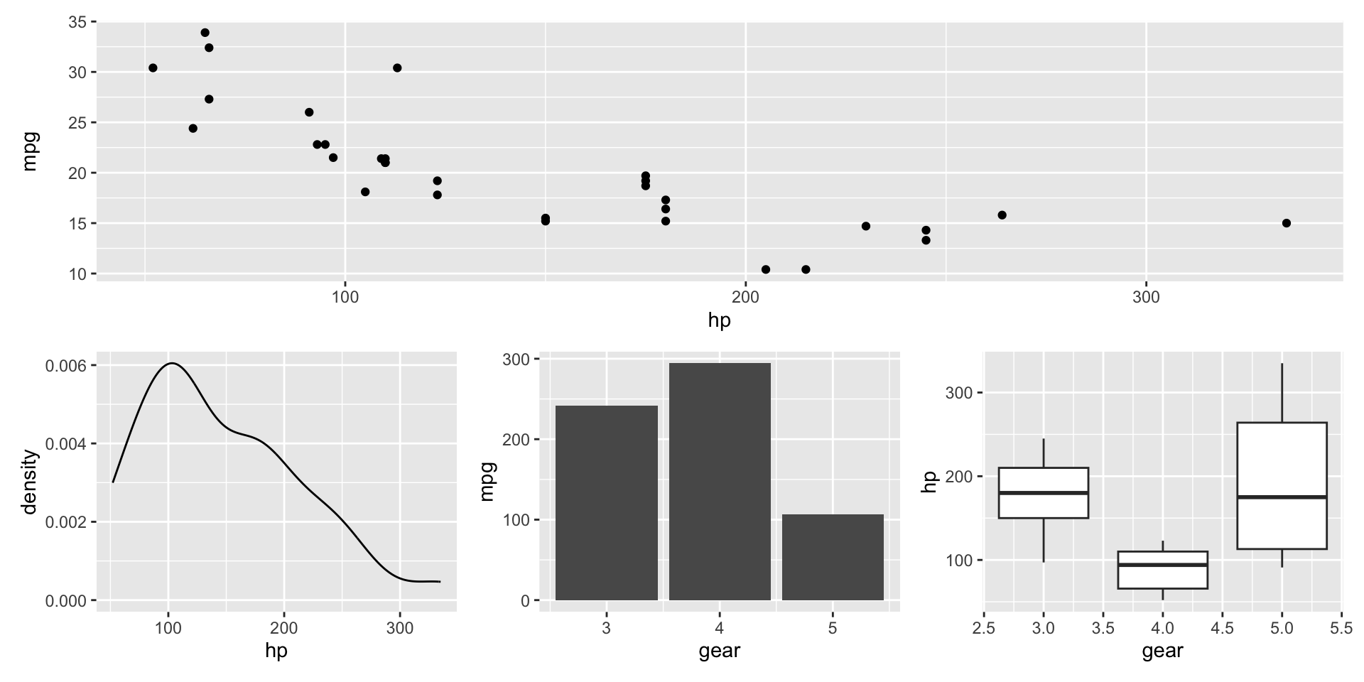
Combining plots
You can set empty spaces using plot_spacer()